Building An Election Night Dashboard With Neo4j Graph Apps: Bloom, Charts, And Neomap
William Lyon
November 28, 2020
12 min read
A few weeks ago there was an election in the US. On election night as I was waiting for the results to come in I poured myself a stiff drink and sat down to watch EJ Fox and Ian Johnson on the Coding With Fire livestream as they built data visualizations to help interpret the early returns data coming in. I thought it might be fun to try to import live election results data into Neo4j and see if I could make sense of the early returns. Fortunately the New York Times makes this easy enough by exposing a JSON API endpoint that returns live election returns. EJ and Ian pointed out this endpoint on the livestream and I thought I'd see what I could build using Neo4j tooling to help interpret and visualize the results.
The Data#
The JSON endpoint provided by the New York Times is here. This endpoint returns a JSON object that includes election returns at the county level for each candidate.
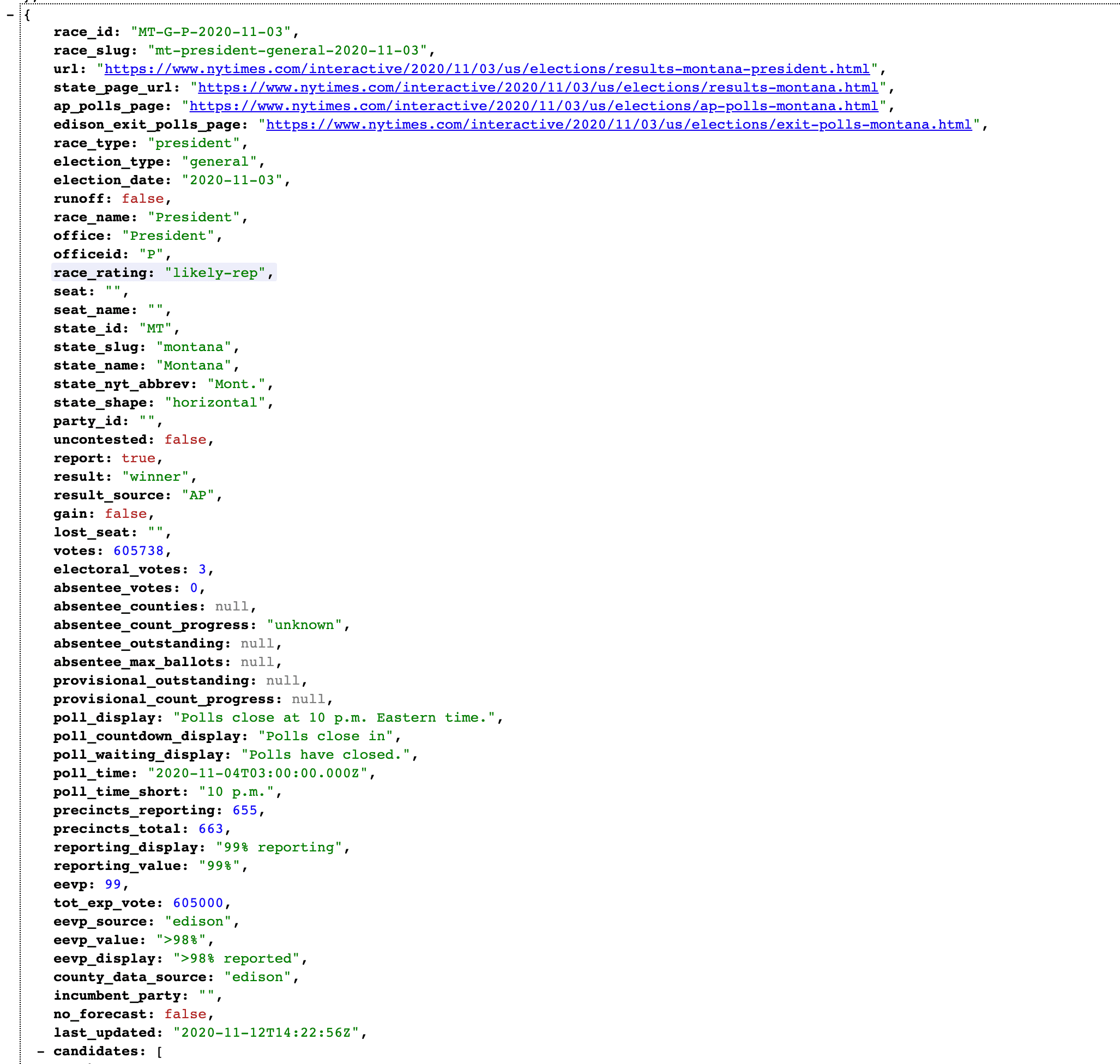
We can make use of the apoc.load.json procedure in the APOC Neo4j standard library to import this data into Neo4j by pulling this data directly from the endpoint and writing to Neo4j.
CALL apoc.load.json("http://static01.nyt.com/elections-assets/2020/data/api/2020-11-03/national-map-page/national/president.json") YIELD value
UNWIND value.data.races AS race
MERGE (s:State {name: race.state_name})
SET s.electoral_votes = race.electoral_votes,
s.result = race.result,
s.id = race.state_id,
s.votes =race.votes,
s.absentee_votes = race.absentee_votes

WITH race,s
UNWIND race.counties AS county
MERGE (c:County {fips: county.fips})
SET c.name = county.name,
    c.trump = county.results.trumpd + county.results_absentee.trumpd,
    c.biden = county.results.bidenj + county.results_absentee.bidenj,
    c.expected_votes = county.tot_exp_vote,
    c.trump_lead = c.trump > c.biden,
    c.biden_lead = c.biden > c.trump,
    c.votes_2016 = county.votes2016,
    c.margin_2016 = county.margin2016
MERGE (c)-[:IN_STATE]->(s)
WITH null AS foobar
MATCH (s:State {result: "winner"})<-[:IN_STATE]-(c:County)
WITH s, sum(c.trump) AS trump, sum(c.biden) as biden
SET s.trump_winner = trump > biden,
    s.biden_winner = biden > trump
This Cypher script imports the data into Neo4j using a simple graph model of counties and states:
(:County)-[:IN_STATE]->(:State)
where we store properties such as the number of electoral votes on the State nodes, and votes by candidate on each County node.
Periodic Data Updates#
Since this data is coming in live on election night and updated frequently we want to make sure that we're regularly refreshing the data imported in Neo4j. We'll make use of another APOC procedure to do this: apoc.periodic.schedule which allows us to schedule background jobs using Cypher. Let's create a background job to update our data every 5 minutes:
CALL apoc.periodic.schedule('election-import', statement, 300)
Here statement is the import statement above. We can make sure our background job is scheduled and running by listing all our background jobs:
CALL apoc.periodic.list()
Now that we're importing and updating live election result data, it's time to start interpreting the results.
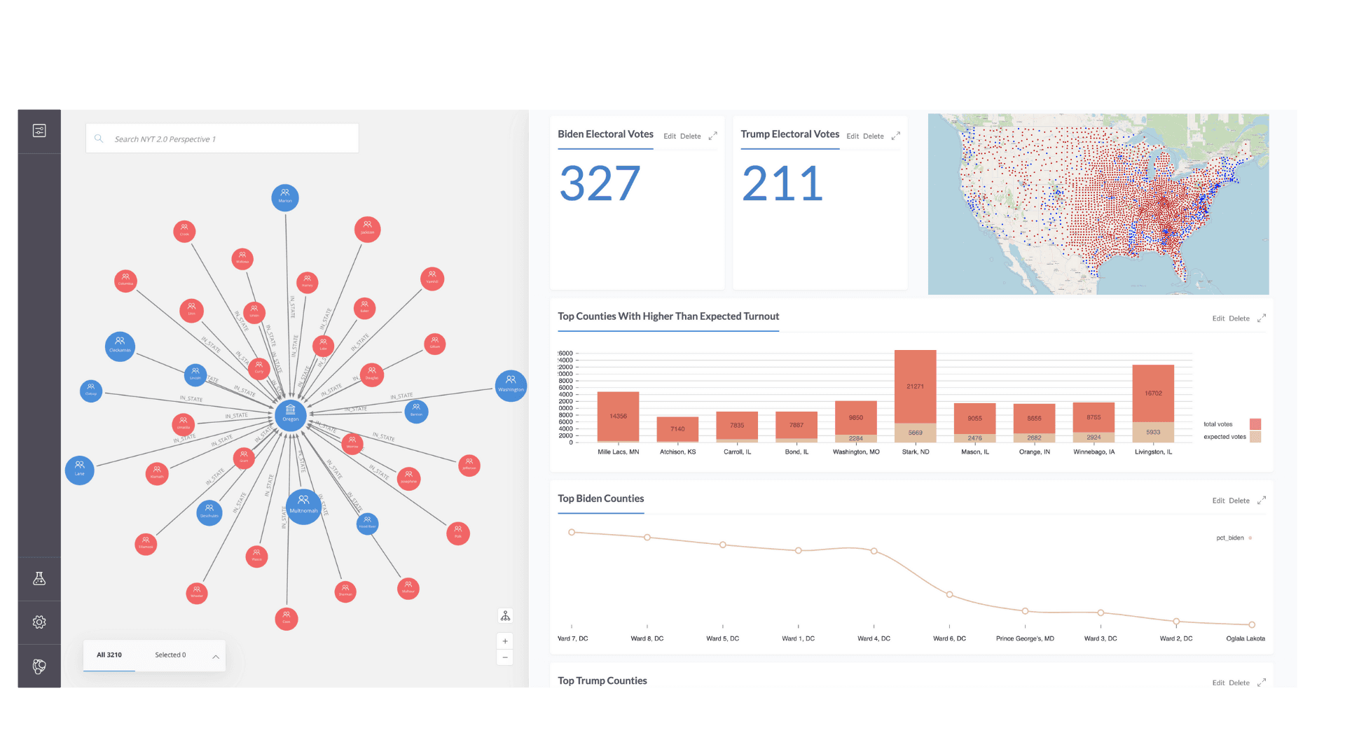
Data Visualization With Neo4j Bloom#
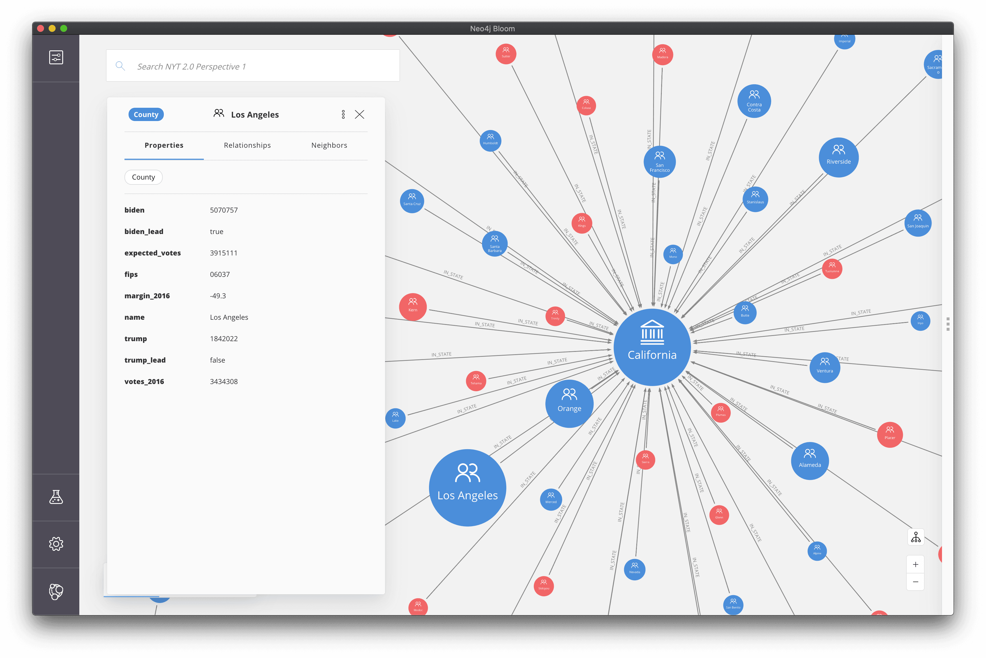
First, we'll use Neo4j Bloom to explore the data using an interactive graph visualization. Bloom is a super powerful graph data visualization tool for exploring data in Neo4j. Bloom allows us to express complex graph patterns to visualize using simple natural language search, meaning we don't need to write any Cypher to visualize our data. WebGL acceleration enables us to visualize and work with large graphs. Bloom is available in Neo4j Desktop so we just need to select "Neo4j Bloom" under the "Open in" dropdown for our database in Neo4j Desktop. You can learn more about Neo4j Bloom here.
Putting Things In Perspective#
Graph visualizations in Bloom can be styled using a perspective. The perspective is a configuration that defines a certain business view or domain that defines how nodes and relationships should appear in the visualization. You can read more about perspectives in the Neo4j Bloom documentation. We'll make use of rule-based styling in our perspective to bind node size and color to our data to help convey election result details.
Rule Based Styling#
Styling node size
Rule-based styling allows us to bind node and relationship size and colors to our data. Let's style county nodes based on population size so that counties with larger population sizes appear as larger nodes.
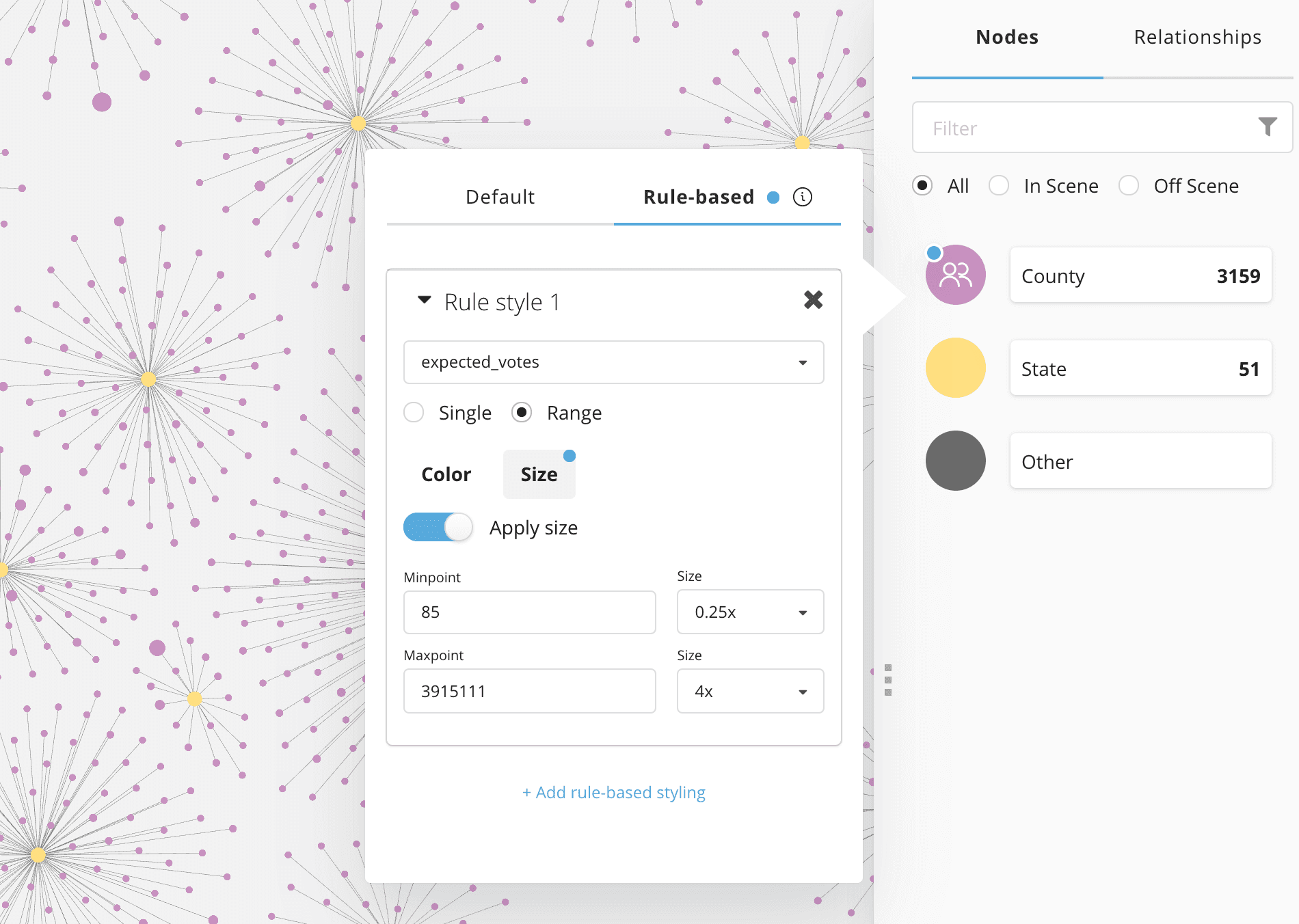
Note that we need to specify the min and max values when creating a rule-based style configuration. We can run the following Cypher query to inspect our data and return the relevant min and max values:
MATCH (c:County)
RETURN min(c.expected_votes), max(c.expected_votes)
Next, let's style state size according to the number of electoral votes allocated to each state. This means that states with more electoral votes (or more significance) will appear larger.
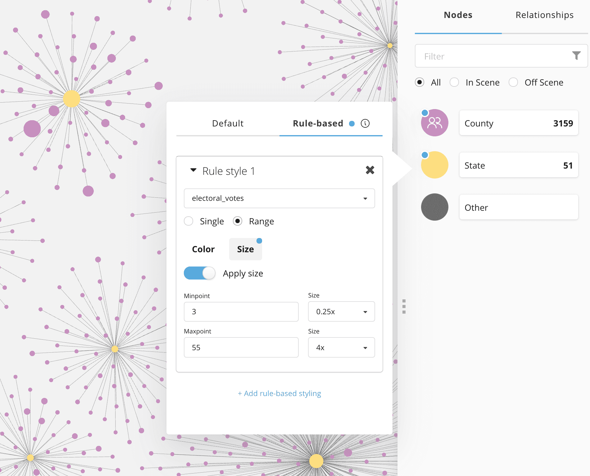
Styling node color
Similarly, we can also use rule-based styling to bind the color of the nodes in our visualization to our data. A typical use case here is to color nodes according to the result of a community detection or clustering algorithm. In this case we will add a rule to color County and State nodes blue in the case that the Democratic party candidate is leading and red for the jurisdictions where the Republican candidate is in the lead.
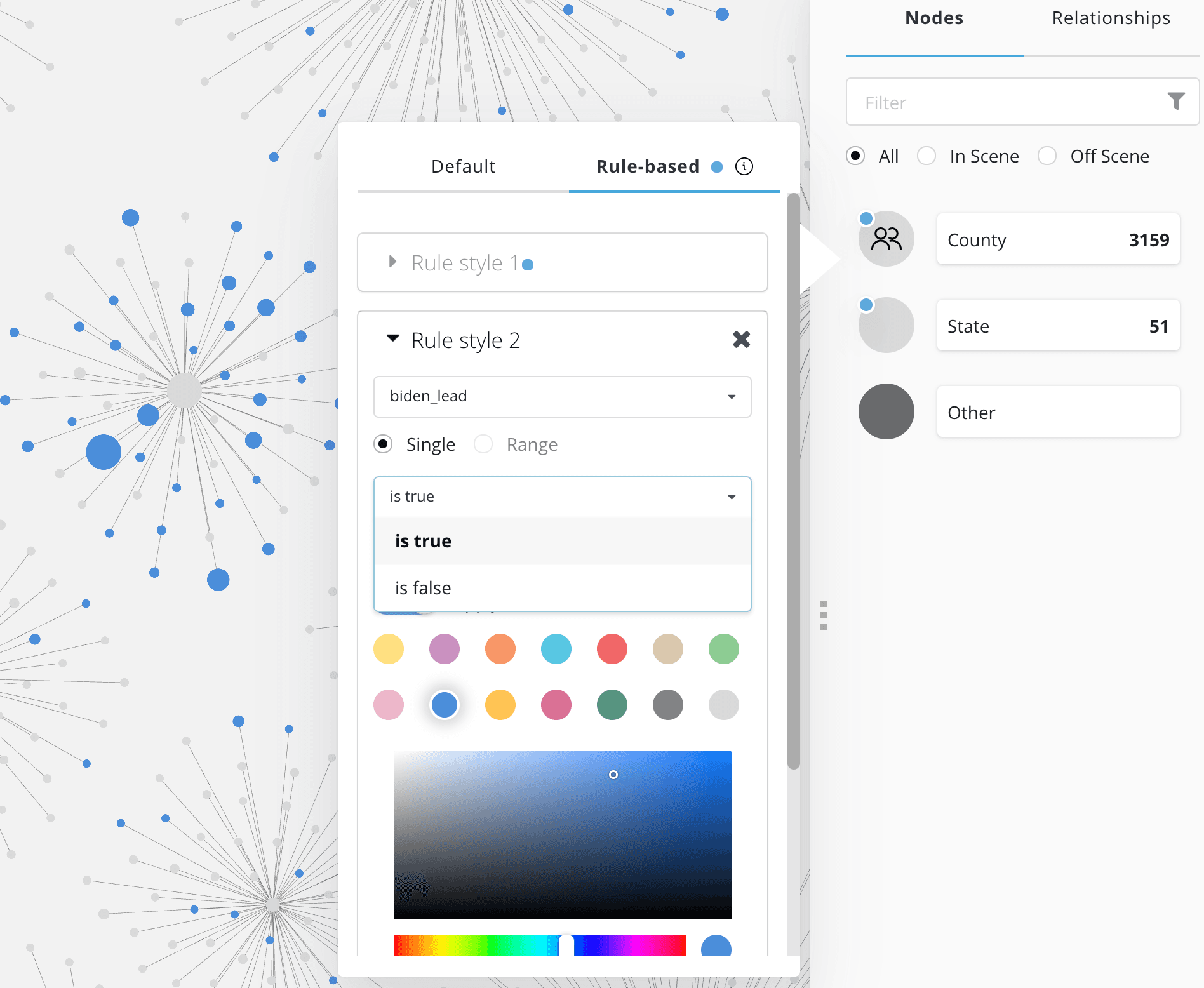
Now, as we explore the graph we can make use of the rule-based styles to quickly see the most significant jurisdictions and which way the early election returns are leaning in those jurisdictions.
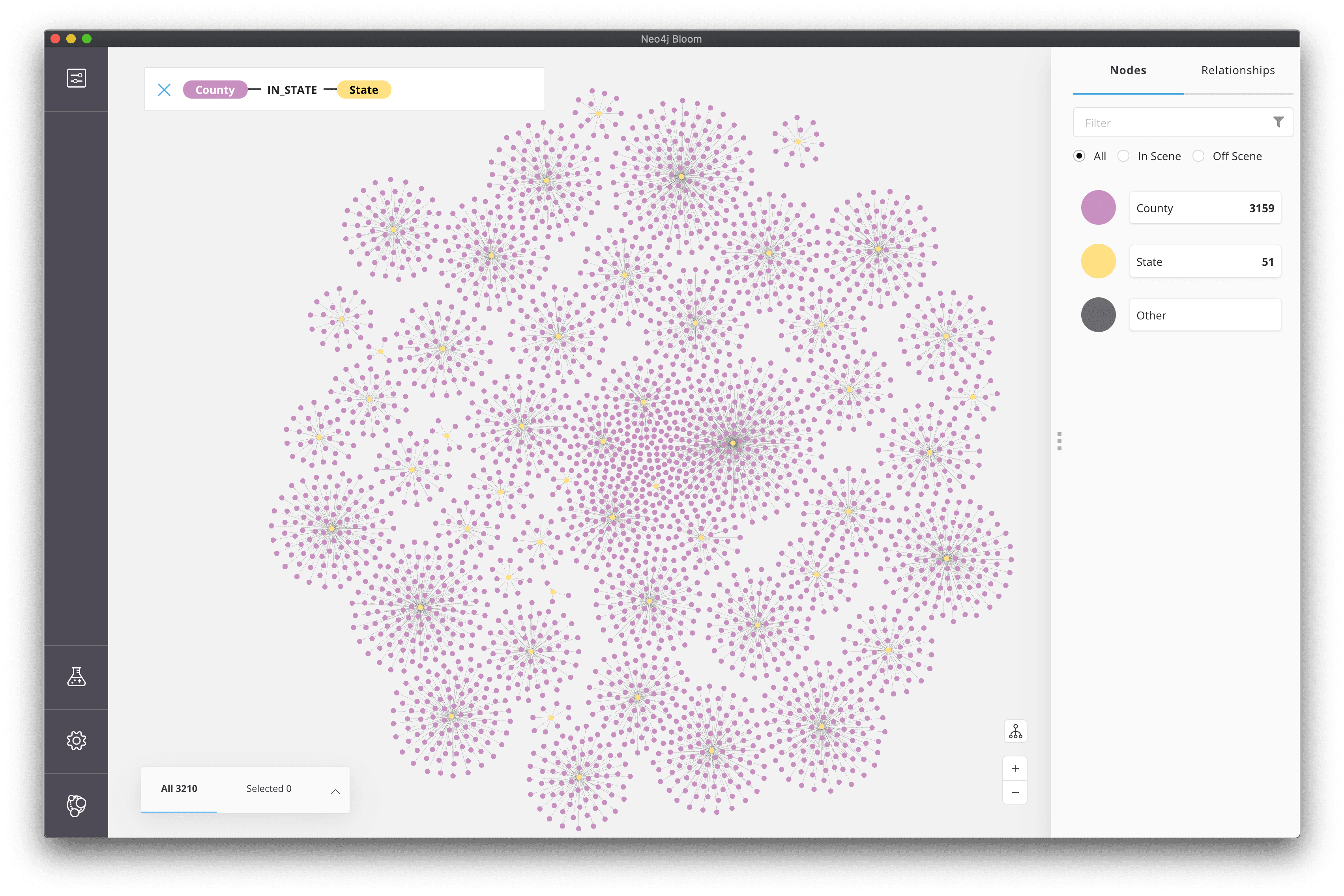
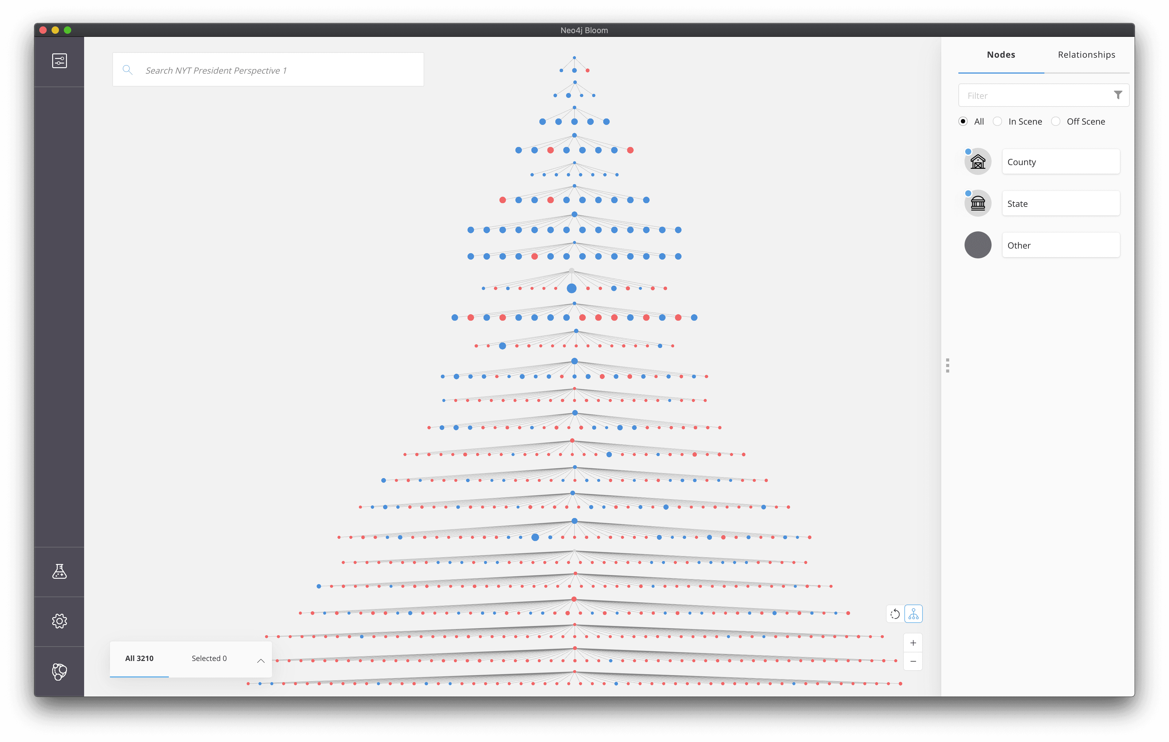
Hierarchical Layout#
A force directed layout is typically used in graph visualizations. This layout often results in groups of nodes that are more connected than others being grouped together. This allows us to visually interpret node clusters. However, sometimes the data we are working with is inherently hierarchical, such as a reporting hierarchy within an organization or in our case, a hierarchy of states and counties. Neo4j Bloom allows us to choose between force directed and hierarchical layouts when rendering the visualization.
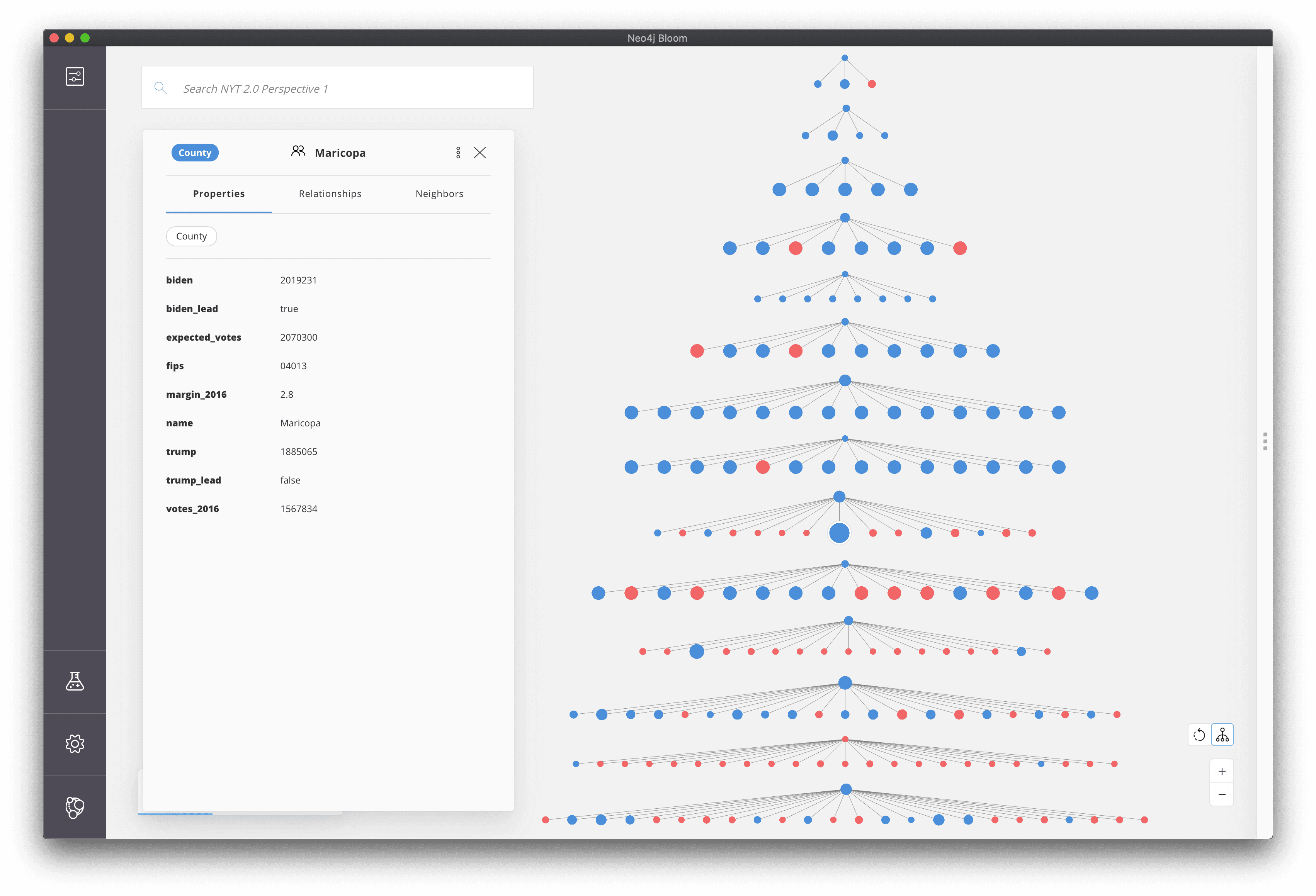
And zoomed out the hierarchical layout even looks a bit like a Christmas Tree 🎄
Building Dashboards With Neo4j Charts#
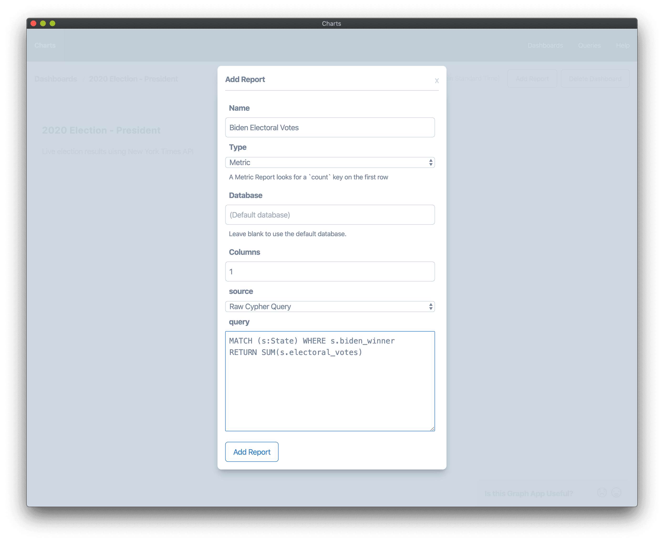
Neo4j Bloom is great for interactive graph visualizations, however sometimes the answer to our question is best expressed in tabular form which can be visualized as charts, instead of graphs. Fortunately, Adam Cowley has recently released the Neo4j Charts graph app for Neo4j Desktop that allows us to build dashboards of charts to help interpret our graph data. For a full overview of the features of the Charts graph app see this blog post. First, we'll install the Charts graph app using the Graph App Gallery in Neo4j Desktop, or we can also visit install.graphapp.io

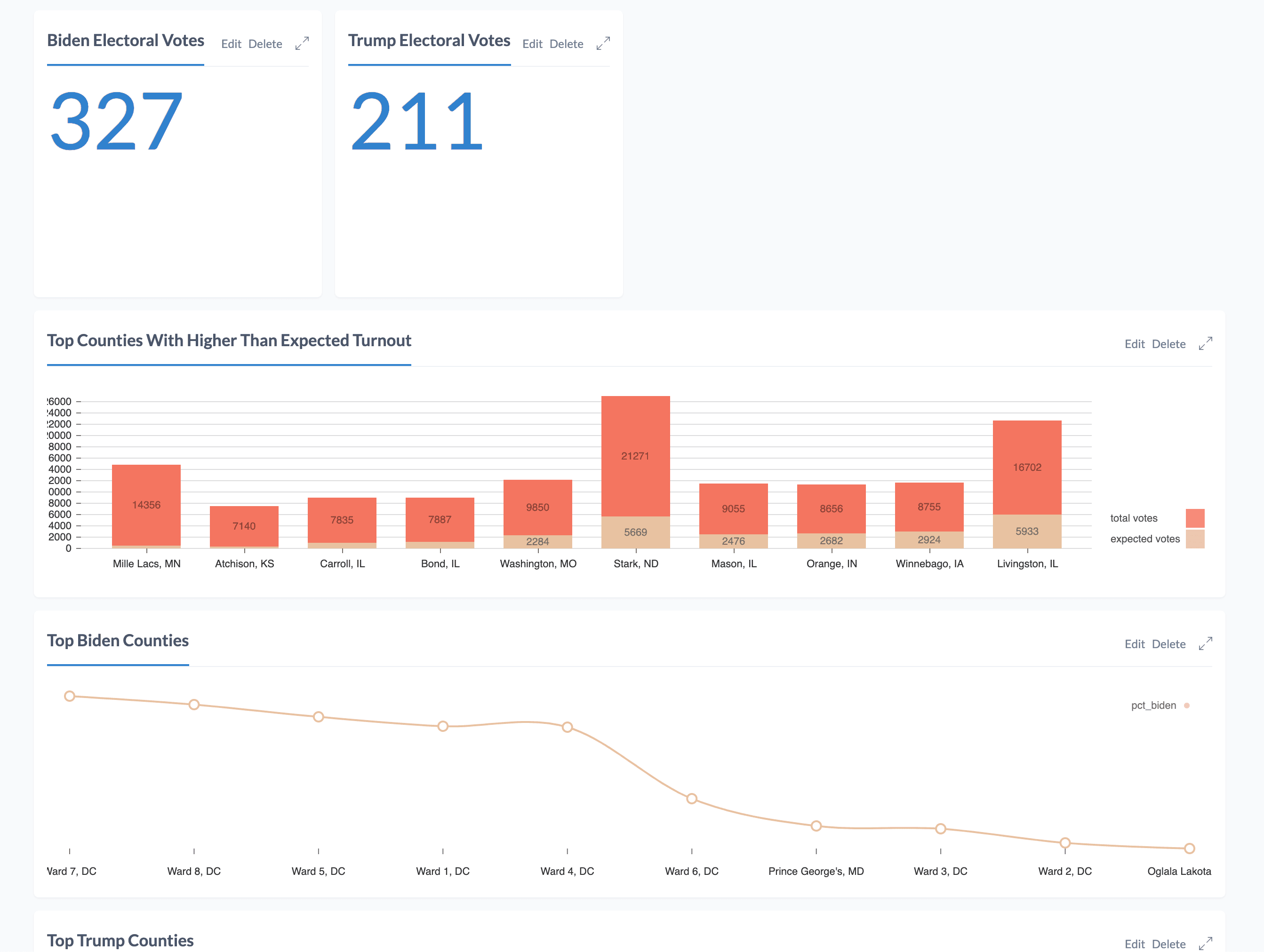
After installing and opening the Charts graph app, let's get started creating a dashboard and adding reports to it. For each report that we add to the dashboard we'll need to include a Cypher query that fetches the data from Neo4j necessary to render the report chart. Let's start off with a simple "metric", showing a single value for the report, in this case the number of electoral votes assigned to each candidate. Our Cypher queries for this report match on each state then sum the number of electoral votes where the given candidate has been declared the winner:
MATCH (s:State) WHERE s.biden_winner
RETURN SUM(s.electoral_votes)
and
MATCH (s:State) WHERE s.trump_winner
RETURN SUM(s.electoral_votes)
And now let's add a metric report to our dashboard using this Cypher query.
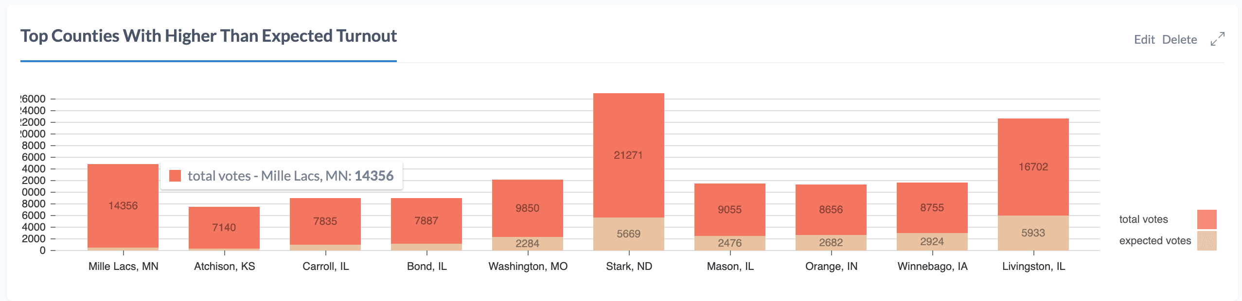
Next, let's find counties that have higher than expected voter turnout. To do this we'll use the number of "expected votes" included in the NYT dataset and the number of votes reported so far per county to calculate a metric showing where the number of votes cast exceeds the expected number. Our query will return both the number of expected votes and total votes per county, ordered by the percentage of expected votes exceeded.
MATCH (s:State)<-[:IN_STATE]-(c:County) WITH c.expected_votes AS expected_votes, c.biden + c.trump AS total_votes, c.name + ", " + s.id AS county
WITH toFloat(total_votes) / expected_votes AS turnout, county, expected_votes, total_votes
WITH * where turnout IS NOT NULL
RETURN "expected votes" AS key, expected_votes AS value, county AS index ORDER BY turnout DESC LIMIT 10

UNION

MATCH (s:State)<-[:IN_STATE]-(c:County) WITH c.expected_votes AS expected_votes, c.biden + c.trump AS total_votes, c.name + ", " + s.id AS county
WITH toFloat(total_votes) / expected_votes AS turnout, county, expected_votes, total_votes
WITH * where turnout IS NOT NULL
RETURN "total votes" AS key, total_votes AS value, county AS index ORDER BY turnout DESC LIMIT 10
We'll add this query to our dashboard by creating a stacked bar chart report.
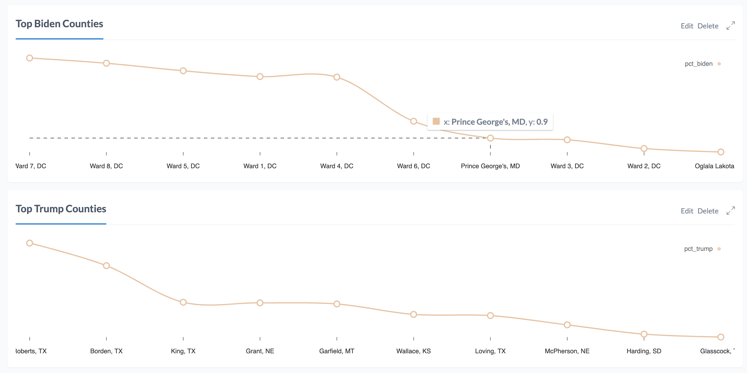
Next, we want to determine which counties voted most overwhelmingly for a specific candidate. To do this we'll query for the counties with the highest percentage of votes for Biden:
MATCH (s:State)<-[:IN_STATE]-(c:County) WHERE c.biden > 0 AND c.trump > 0
WITH (toFloat(c.biden) / (c.biden + c.trump)) AS pct_biden, c.name + ", " + s.id AS county
RETURN *  ORDER BY pct_biden DESC LIMIT 10
And the same for Trump:
MATCH (s:State)<-[:IN_STATE]-(c:County) WHERE c.biden > 0 AND c.trump > 0
WITH (toFloat(c.trump) / (c.biden + c.trump)) AS pct_trump, c.name + ", " + s.id AS county
RETURN *  ORDER BY pct_trump DESC LIMIT 10
Now, let's add these queries to the dashboard using a line chart report:
If we view our dashboard now we'll see all our report visualizations together.
We can add additional reports taking advantage of more complex charts such as radar charts, bump charts, and more. What interesting questions can you think of that can best be explained with these types of charts?
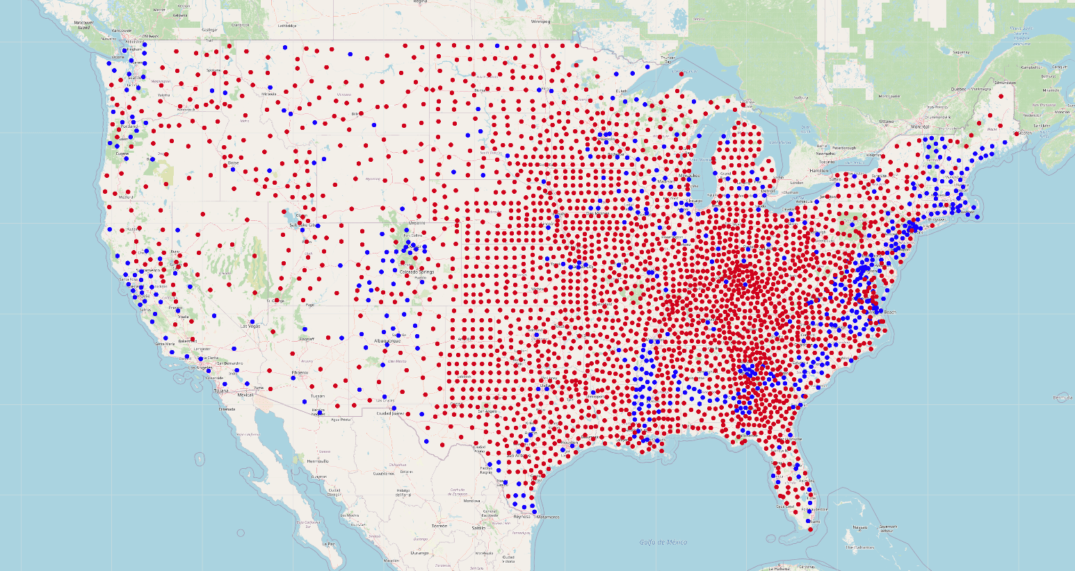
Visualizing Geospatial Data With Neomap#
Our election results dashboard wouldn't be complete without a map visualization. To create our map visualization we'll use another graph app for Neo4j Desktop called Neomap. Neomap was created by Estelle Scifo and allows us to visualize geospatial data from Neo4j. You can learn more about Neomap in this introductory blog post and an example of visualizing routes with Neomap. We'll install Neomap using the Graph App Gallery in Neo4j Desktop or by visiting install.graphapp.io
First, however we need to add some geospatial feature data to our database. There are a few options here: we could add polygon geometries for each state or county to create a choropleth map, but let's keep things simple and create a single marker for each county and color the marker according to the party of the candidate leading the jurisdiction (using the convention of red for Republican and blue for Democratic).
For these markers we'll need the latitude and longitude of the centroid of each county. I found a dataset from the National Weather Service that includes the centroid of each county in the US.
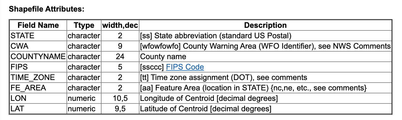
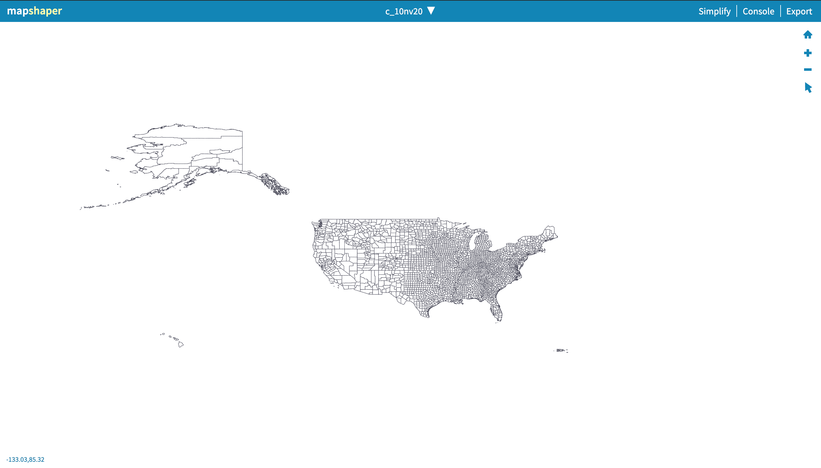
This data is available as a shapefile, which is a binary format for geospatial data. We'll need to convert this to a format such as geojson or CSV which makes it easier to import into Neo4j. To do this we could use a tool like GDAL which can convert geospatial data between just about every format, but today we'll use an online tool called Mapshaper to convert this shapefile data to CSV. We'll open the shapefile in Mapshaper, select export to CSV and now we have our county centroid data in CSV format.
Now, let's use Neo4j's LOAD CSV functionality to import this data into our dataset. First, let's make sure we can read the CSV file and see what data we're working with:
LOAD CSV WITH HEADERS FROM "file:///counties.csv" AS row
RETURN row LIMIT 1
{
  "FE_AREA": "se",
  "TIME_ZONE": "E",
  "FIPS": "23029",
  "COUNTYNAME": "Washington",
  "STATE": "ME",
  "LON": "-67.6361",
  "CWA": "CAR",
  "LAT": "45.0363"
}
We'll use the FIPS property to look up our County nodes and add a Point property to each county which represents the latitude and longitude of the centroid of each county.
LOAD CSV WITH HEADERS FROM "file:///counties.csv" AS row
MATCH (c:County {fips: row.FIPS})
SET c.location = Point({latitude: toFloat(row.LAT), longitude: toFloat(row.LON)})
Now that we have our geospatial data for each county, in Neomap we'll add a layer to visualize the county data. With Neomap we can define a custom Cypher query returning the data we want to visualize, so we'll filter for counties where the Democratic candidate is leading and color the markers in that layer blue (repeating the process for red makers for the Republican candidate)
MATCH (c:County) WHERE EXISTS(c.location) AND c.biden_lead
RETURN c.location.latitude AS latitude, c.location.longitude AS longitude
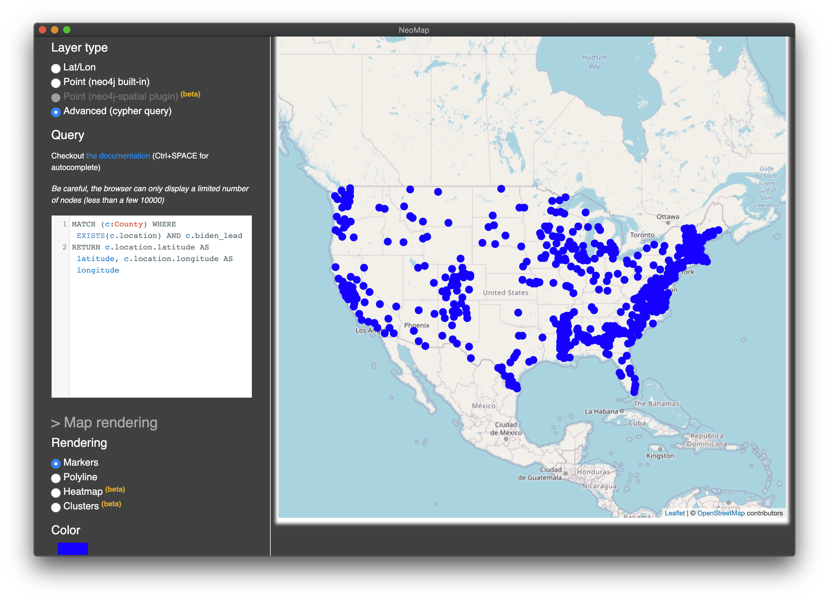
When both layers are added we can see the distribution of each party's leading candidate across counties in the US. As a next step we might want to scale the size of each county marker according to population or perhaps render a polygon of the bounds of each county instead of a single marker, but this is a good start for our dashboard.
The Dashboard#
Putting everything together we now have an interactive live-updating election night dashboard showing graph data expressed in charts, graph visualization, and map view.
Stay Updated
Get notified about new posts and videos